ECE / IK12 / Montessori Schools
A responsive website redesign of
200+ schools to increase V2I
PROJECT OVERVIEW
What is ECE / IK12 / Montessori?
ECE refers to Early Childhood Education, which focuses on the formal education and care of children from infancy to preschool. IK12 refers to the education of kindergarteners through 12th grade. Montessori is an educational approach that encourages independence, hands-on learning, and learning at each child’s own pace.
Spring Education Group (SEG) is a for-profit private school company that owns over 200 private schools across the USA. They own all of the ECE, IK12, and Montessori schools in this project.
My Role & Responsibilities
UX/UI Designer & Researcher
My colleague and I were co-designers for this project and were given the task to redesign all 200+ school websites under the ECE, IK12, and Montessori divisions.
Team
2 UX/UI Designer & Researchers
1 Director of Web Product Marketing
1 Web Product Marketing Manager
4 Developers
Timeline
1 month / April 2024 for research
2.5 months / May - mid July 2024 to design 4 scalable website templates to apply to 200+ school brands
Tools
Figma
Zoom
Google workspace
EXPLORING THE PROBLEM & DEFINING BUSINESS NEEDS
The Visit to Inquiry (V2I) rate had been consistently decreasing over the prior 6 months.
The schools leaders were looking to improve the V2I rate.
There are many schools under the ECE, IK12, and Montessori divisions that SEG owns and
all the schools had the same look and feel using the same template.
The schools wanted to move away from this uniformed template look, and wanted each of
the brands to have their own identity with their brand colors.
My colleague and I sat down with key stakeholders and asked:
“What are we trying to achieve with this redesign?”
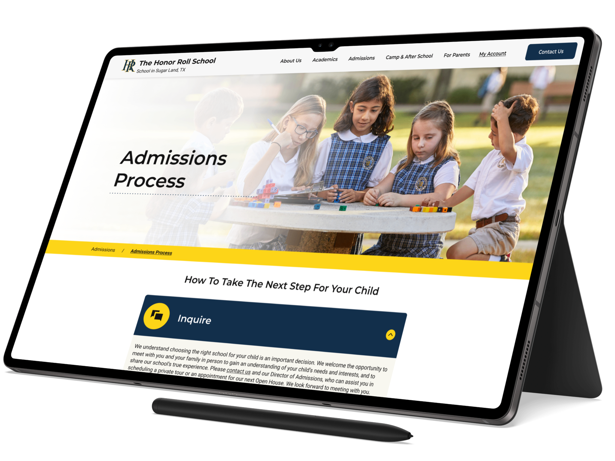
The challenge:
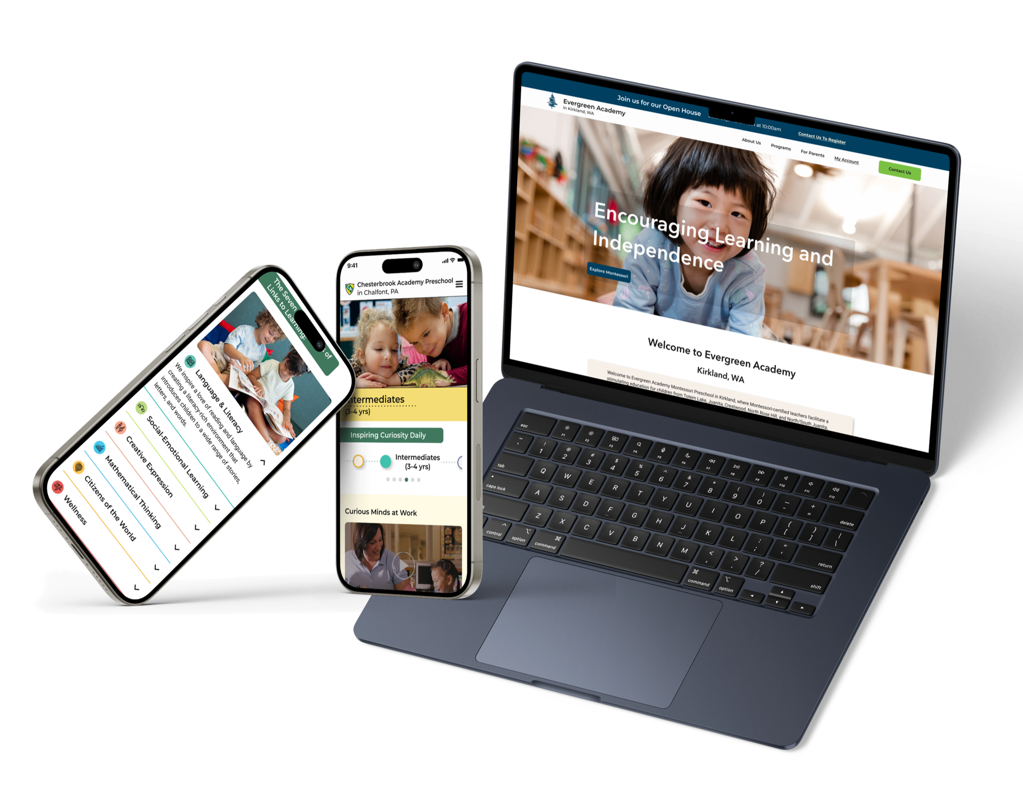
To develop four flexible website templates (Umbrella, ECE, IK-12, and Montessori) that could scale across 200+ school websites.
Adapt these templates to each school’s existing brand colors and visual identity.
Increase visit to inquiry rate for web and phone leads.
Showcase the uniqueness and value of each school that helps to set them apart from others.
SOLUTION: A Flexible Foundation for 200+ Schools
To come up with our solution, we asked ourselves:
How do you create consistency at scale
without making 200+ schools feel the same?
After much research, our solution was to create four flexible website templates: one for
the Umbrella websites, one for ECE, one for IK12, and one for Montessori schools, while
giving each school the flexibility to express its own brand through color and visual identity.
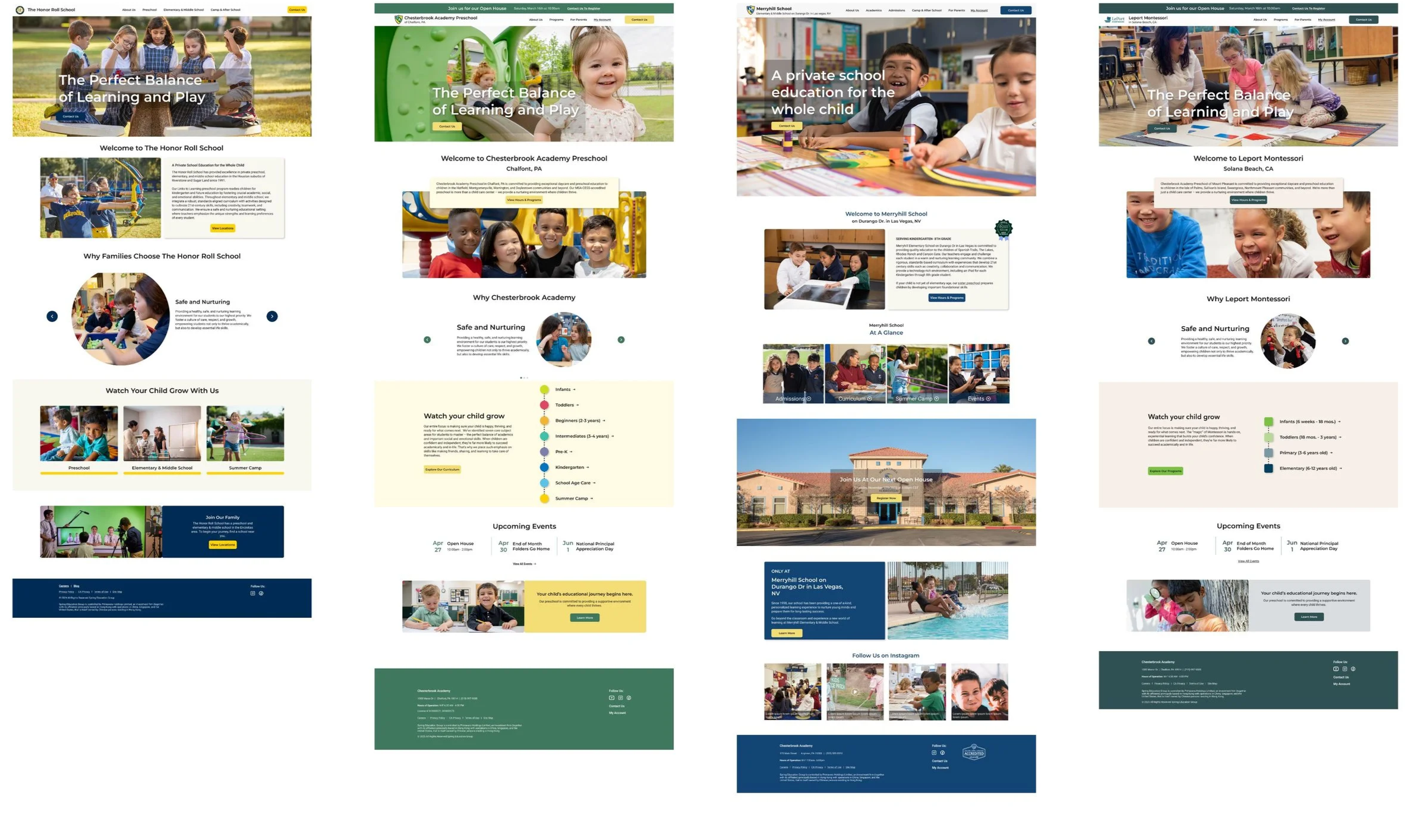
View Live Sites Below
UNCOVERING THE OPPORTUNITIES
Before designing the new experiences, we needed to understand where the existing
websites were falling short. Through research across users, stakeholders, the existing websites,
and competitors, we identified the opportunities that would shape our design direction.
Findings from the Qualitative Survey
My colleague and I distributed a qualitative survey through Slack networks and LinkedIn to explore how
current and prospective parents approach the decision-making process when choosing a school.
We surveyed 12 parents, 54% of whom had children attending private schools and over
60% with children in primary school or younger.
One of our questions was:
“What is most important to you in a school for your child?”
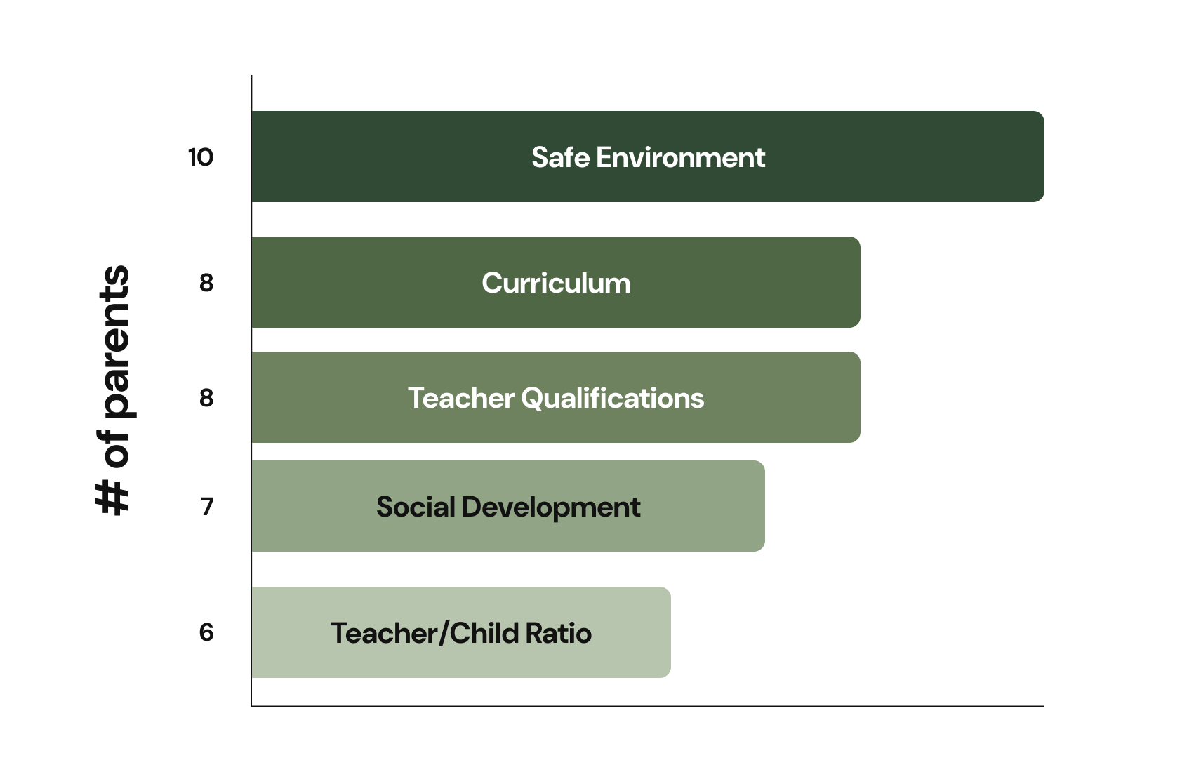
We would later find that these responses closely aligned
with insights from our parent interviews.
HEARING FROM OUR PARENT USERS
We wanted to go beyond what parents said they valued and understand how those priorities
shaped their actual decision-making. Parent interviews gave us deeper insight into their
experiences, questions, and frustrations throughout the school-search process.
One of our questions was:
“What would you like to see on the websites
that is currently missing?”
Leadership/Staff Images and Bios
Parents want to know who will be caring for their children daily. Showing staff/leadership and their credentials helps build trust in the brand and the school.
Tuition Page Pricing
Parents felt it is important to know the tuition up front before they take a tour, because if it is drastically out of budget, they feel they will have wasted everyone’s time.
A More Mature Look
Parents shared the website felt too “childish” with the neon blue and green colors.
Safety
Safety was discussed on the website, but parents felt it should be emphasized and prioritized more, and should be reflected across the whole website.
Curriculum
What makes this curriculum stand out compared to others? What can they expect their children to learn in each grade and what extracurriculars do they offer?
Professional Photos
Parents find it useful to showcase children actively learning in the
classroom, events that the school holds, etc.
EVALUATING THE EXISTING EXPERIENCE
We then conducted a heuristic evaluation on Chesterbrook Academy in Mount Pleasanton to
identify key usability issues and opportunities for improvement before moving into the redesign.
We chose this school because Chesterbrook is SEG’s largest brand, with the most school locations
across the U.S. Since all schools used the same template, uncovering issues on one school could
reveal opportunities applicable across the rest of the brands.
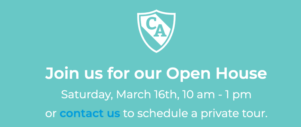
Issue #1: High-Intent Events Lacked a Clear Registration Path
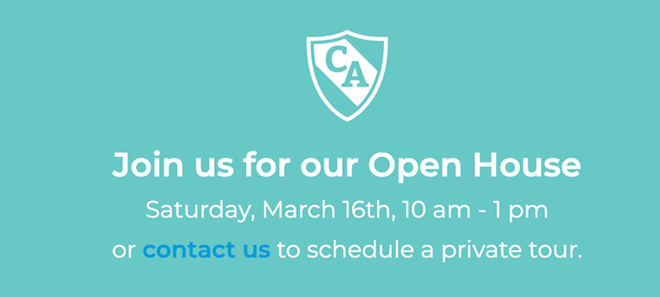
The messaging creates an expectation that users can sign up for the open house.
However, users aren't given a CTA or clear step to complete that action.
The alternative is to contact the school to schedule a tour, which is not the same intent.
This creates friction and ambiguity at a high-intent moment.
Issue #2: Relevant Content Lacked Clear Navigation
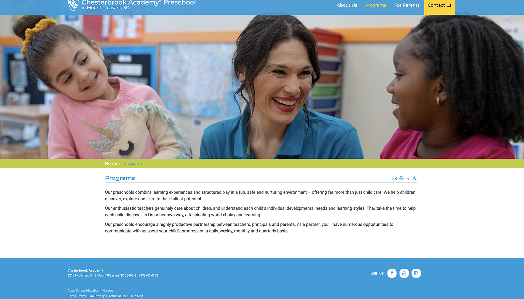
Throughout the site, relevant content was often referenced without direct links or access to learn more.
For example, the Program page mentions curriculum, teacher partnerships, and family communication without linking to those pages, forcing families to search for the information themselves and allowing more opportunities for users to abandon the page.
Issue #3: Accessibility & Inclusion Issues
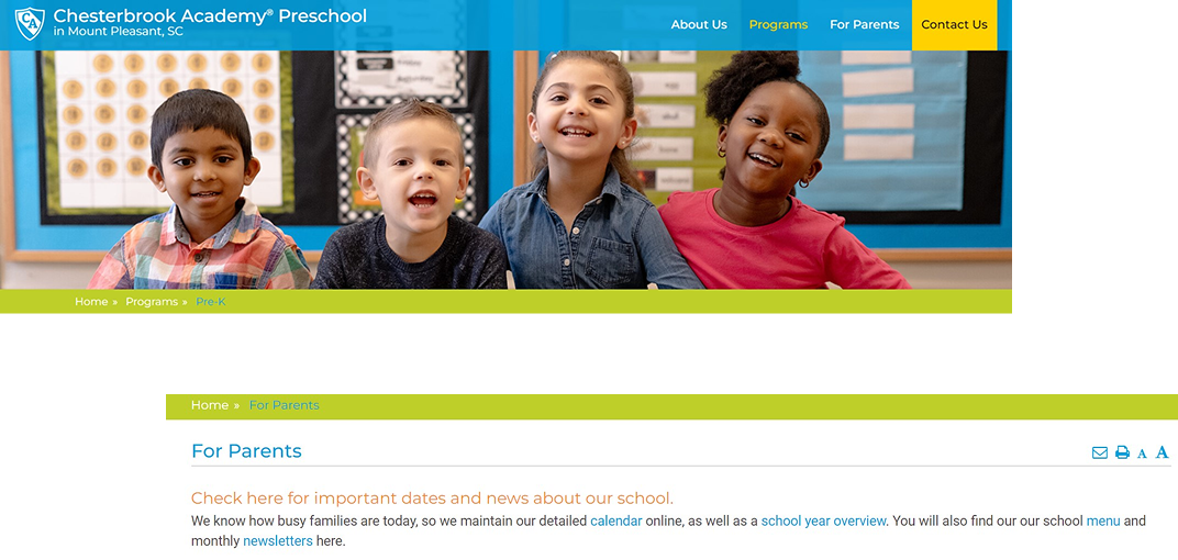
Colors in the navigation, the breadcrumb menu, headings and text throughout the website did not pass accessibility guidelines.
Additionally, some clickable text was distinguished only by color, such as light blue text on a white background (which was inaccessible). Without an additional visual cue, such as underlining, users with color vision deficiencies may not recognize the text as a link.
LOOKING AT OTHER COMPETITORS
To add to our research, my colleague and I conducted a competitive analysis of leading schools
in the ECE and IK12 spaces to identify common patterns, best practices, and opportunities for
differentiation. Some of the ECE schools included Goddard School, Primrose, and KinderCare,
and some of the IK12 schools included The Mead School and The Willows.
Learned Opportunities:
IK12
Uniqueness
Competitor schools had a section that shows what makes them distinct and separates them from other schools.
Significant Stats
Schools displayed their significant stats in an easy and digestible way without users having to read through paragraphs of text.
Visual Storytelling
Schools showcased the student experience through photos and/or videos, allowing families to visualize their child there.
Dynamic/Movement
Competitor sites had an immersive experience to engage and allow the user to focus on one section at a time, with the ability to turn off and on for accessiblity purposes.
ECE
Missing CTA
Competitor schools have a main CTA on their Homepage. Our schools have a hyperlink far down on the Homepage.
Floating Action Button (FAB)
Some competitors have a pinned Inquire form button on desktop, that remains there on all pages of the website.
Visibility of Buttons
While our websites did have a Contact Us hyperlink, competitors have a more apparent button for Contact/Scheduling a Tour.
Inquire Form
Some competitors have an Inquire form located on the
Homepage or they have an anchor link to get to the form.
CREATING DISTINCT BRAND IDENTITIES
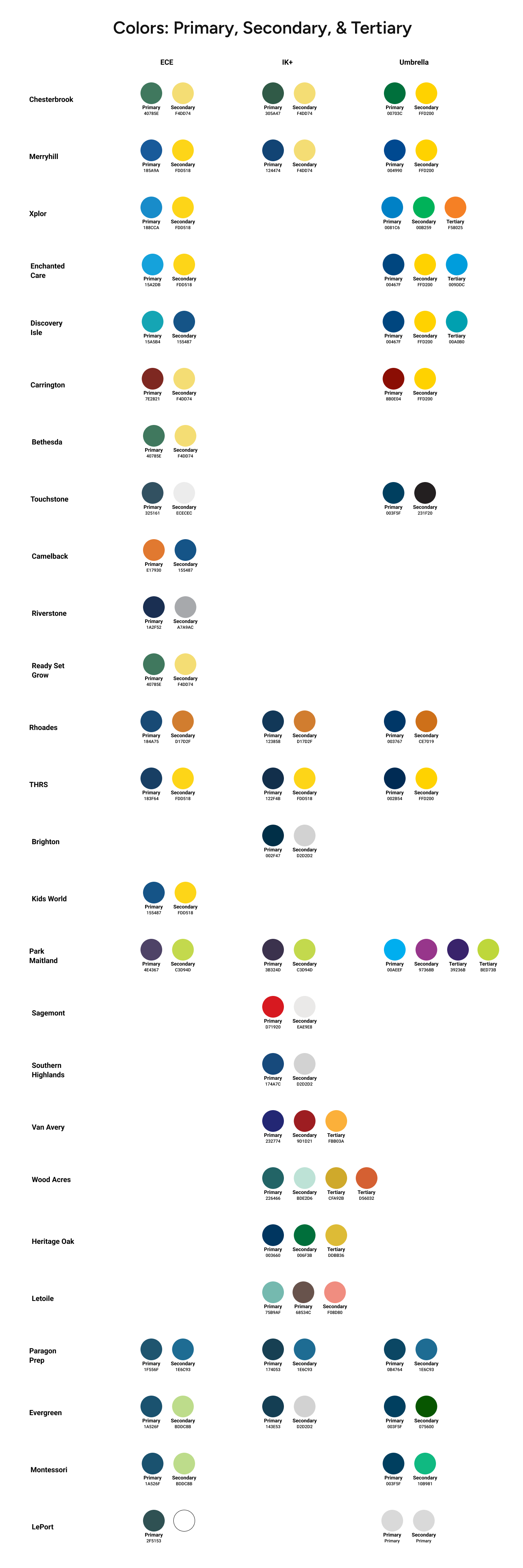
Previously, all 200+ school sites used SEG’s standard brand colors: blue, green, orange, and gray.
For the redesign, we adapted each brand’s color palette to reflect its audience. Umbrella sites stayed true to the core brand colors, while IK12 used deeper tones of the brand colors to convey maturity and ECE used lighter tones of the brand colors to create a more youthful and playful feel.
Some school brands are not represented across every division. For example, Xplor (the third brand listed) does not have any schools in the IK12 division, so the corresponding column is left blank.
FROM INSIGHTS TO DESIGN
With our learned research and insights, we translated key findings into a redesigned experience.
The before-and-after comparisons below highlight how we addressed key gaps identified through
our research, including communicating important priorities like safety, creating a more modern,
engaging experience for families, and adding greater brand uniqueness.
Design Change #1
Strengthening Brand Identity
Brand leaders wanted each school brand to feel more distinct and have its own identity, rather
than feeling like a variation of the same website. We leaned further into each brand through
unique colors, imagery, messaging, and content, while maintaining a shared design system
that could scale across 200+ websites.
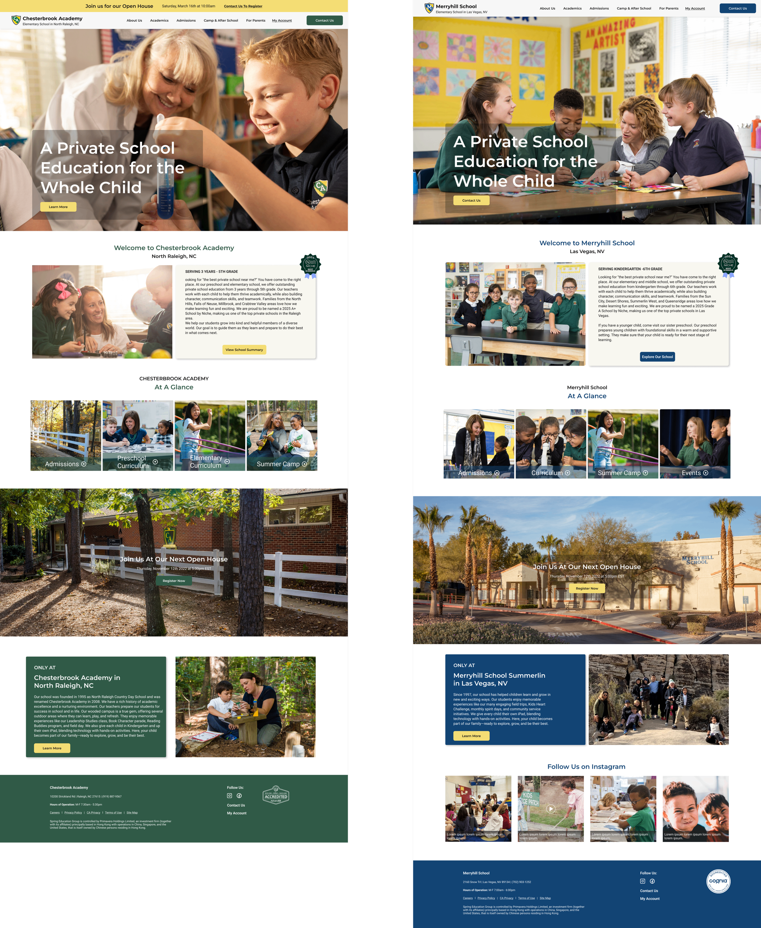
Before
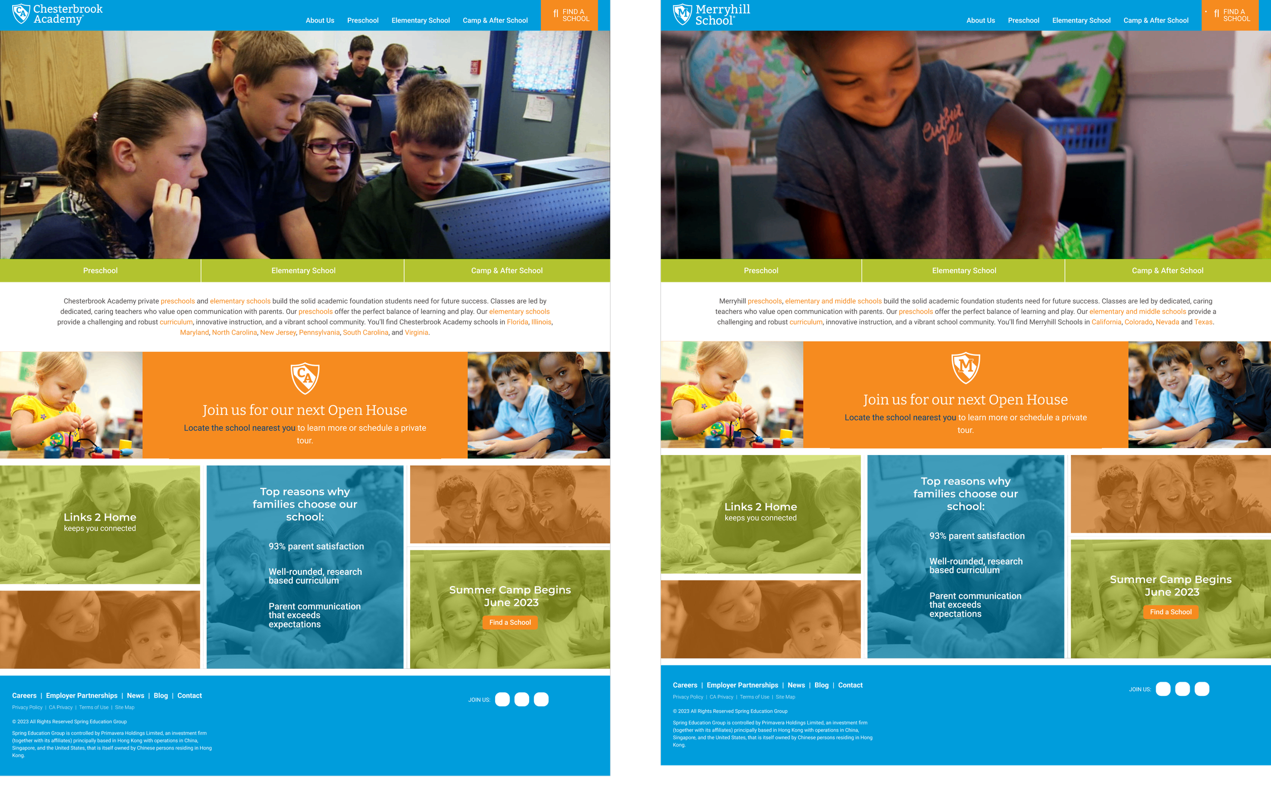
The screenshot on the left is Chesterbrook Academy and the one on the right is Merryhill Schools. Although the schools are not related, they previously used the same colors, templates, and looked identical to one another besides the hero image.
After
After the redesign, each brand is using its own brand colors, imagery, and unique content within a shared template, which helps maintain brand individuality while creating a scalable foundation across 200+ websites.
Depicted here are two school brands utilizing the same IK12 template.
Design Change #2
Prioritizing Safety
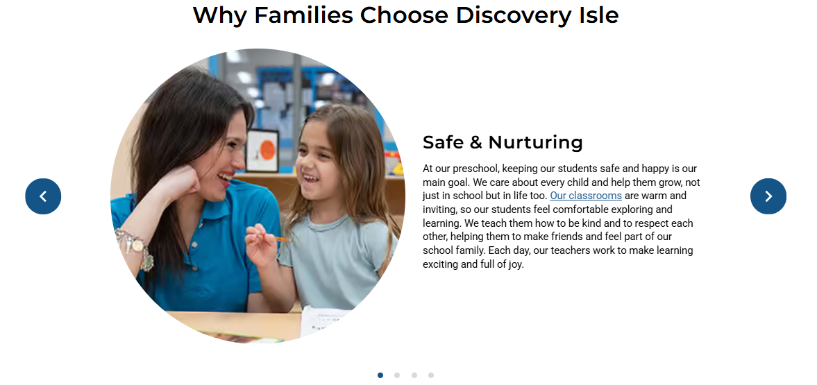
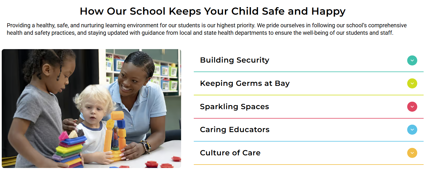
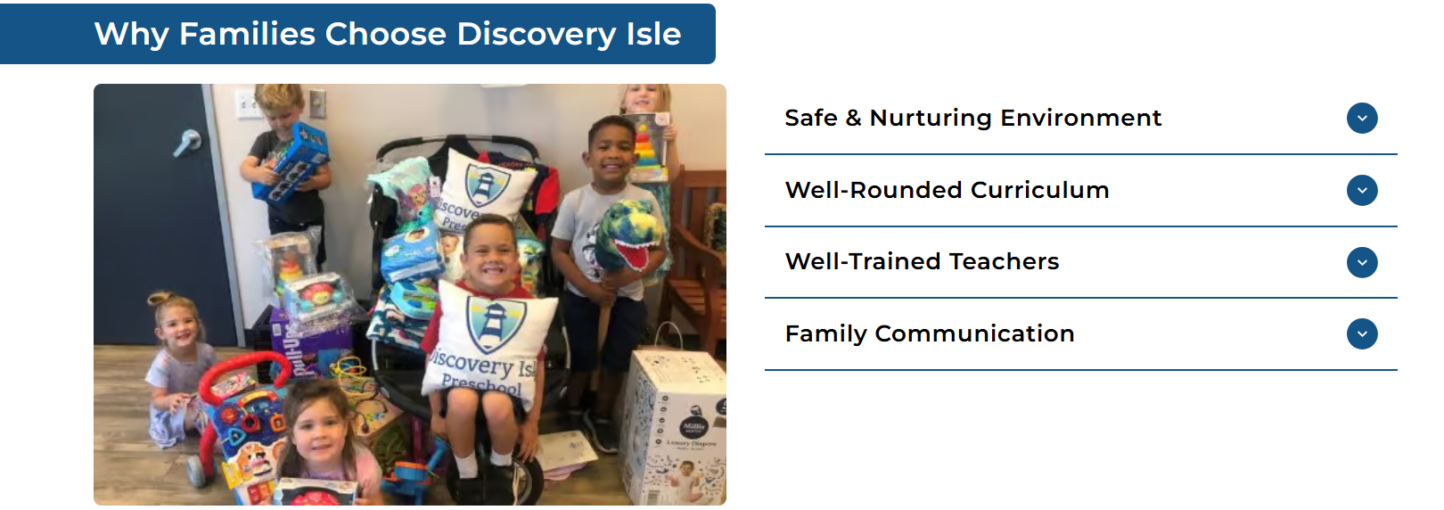
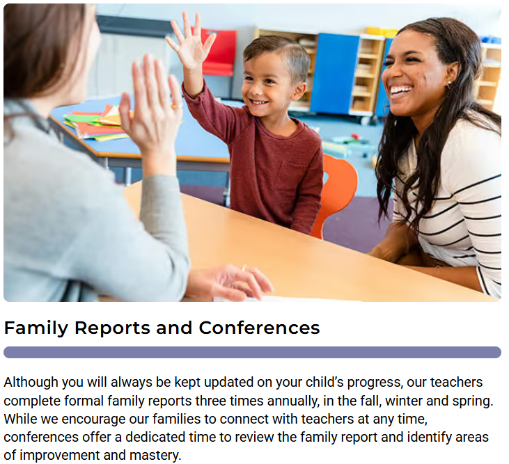
Parent interviews revealed that safety was a key priority for families, but many felt it wasn't emphasized enough throughout the existing website.
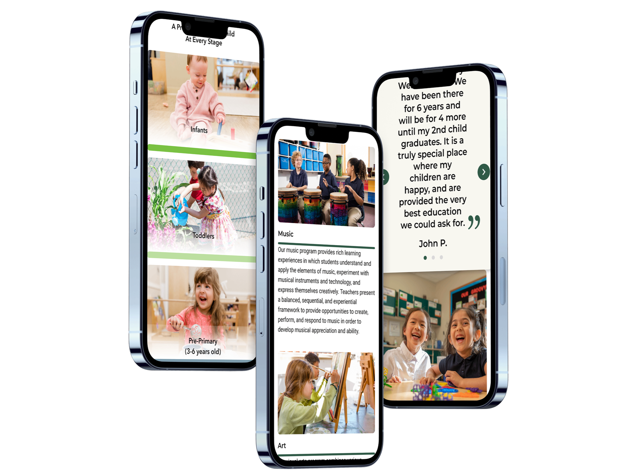
We elevated safety as a core theme by adding a dedicated safety component high up on the homepage and reinforcing that sense of trust across the experience through authentic imagery of teachers and students, warmer visuals, and messaging that highlights a safe, supportive environment.
Design Change #3
Making Open Houses Actionable
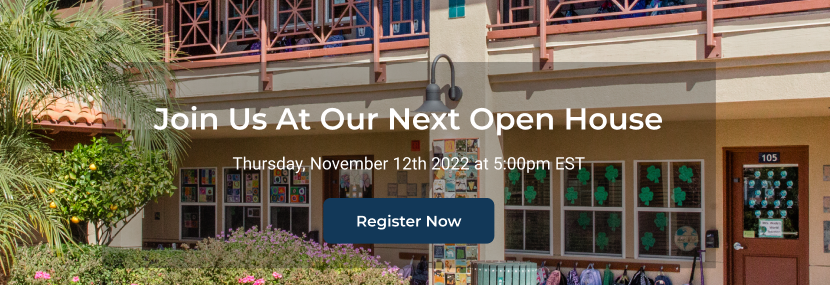
The previous site promoted open houses but didn’t provide a direct way for families to
register. In the redesign, we added a clear Register Now CTA, giving families an immediate
path to sign up while also supporting the business goal of increasing web leads and conversions.
Before
After
These examples represent just a few of the many design changes made throughout the redesign.
Each decision we made was informed by our research, business goals, and the needs of the families
using the sites. Explore the prototypes in the Solution section above to see the full redesign.
VALIDATING THE NEW EXPERIENCE
My colleague and I conducted usability testing with four participants across 10 tasks to
evaluate how easily families could navigate the redesigned experience and find key information.
4 participants
9 of 10 tasks were successfully completed by all participants,
with one additional task achieving a 50% completion rate.
10 tasks
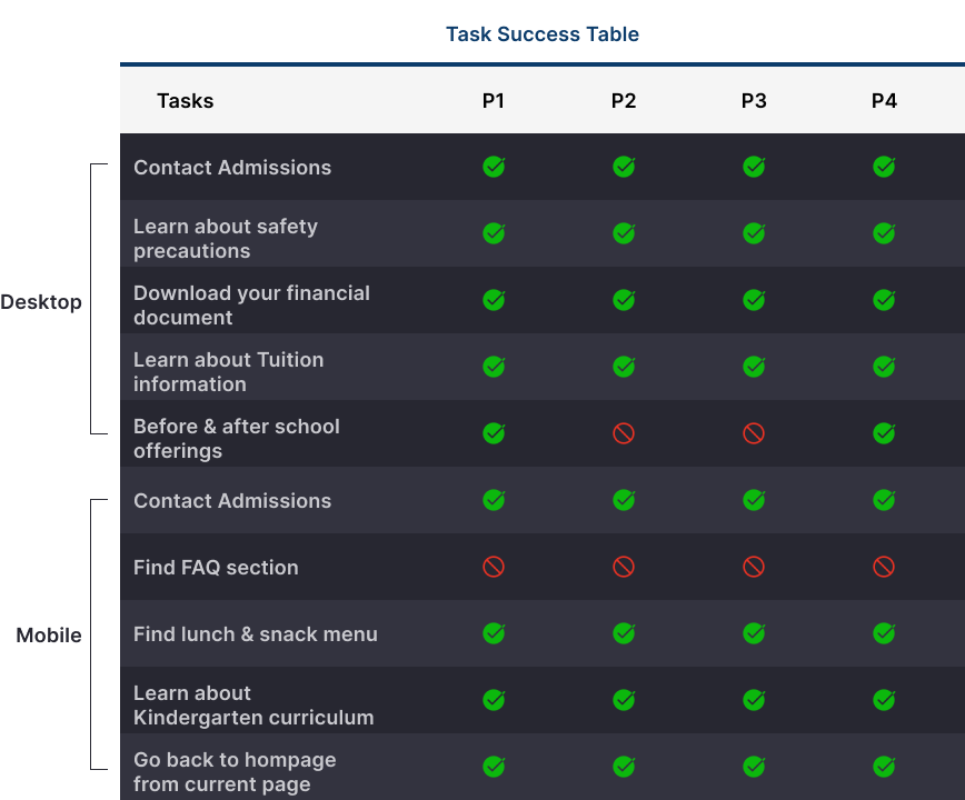
Finding before- and after-school care had a 50% success rate, highlighting an opportunity to improve the visibility of information that can be an important factor in a family’s enrollment decision.
Finding the FAQ was the only task participants consistently struggled with, also an opportunity for us to improve its discoverability. However, this was a lower-priority task since the FAQ provides supplemental information rather than directly influencing enrollment decisions.
DESIGN IMPACT
Goals We Achieved
Created a scalable design system across 200+ websites
Established distinct visual identities for each brand and audience
Addressed key usability and accessibility issues
Addressed key parent/user needs
Made high-intent actions more actionable
Improved and validated the redesigned experience through usability testing
What We Learned
V2I did not increase as anticipated
A better UX doesn't automatically translate to higher conversion
Continued CRO (conversion rate optimization) experimentation was needed
REFLECTIONS MOVING FORWARD
While the redesign improved the overall experience and established a stronger foundation,
V2I did not increase as anticipated, so the work didn't end there. Our results showed that
creating a better experience alone isn’t enough to move users through the inquiry funnel.
This led us to launch our current A/B Test Program, which focuses on
continued experimentation with content, CTAs, and conversion
pathways to better understand what drives families to inquire.
View More Projects: