BASIS Independent
Simplifying and standardizing the form submission experience to increase inquiries
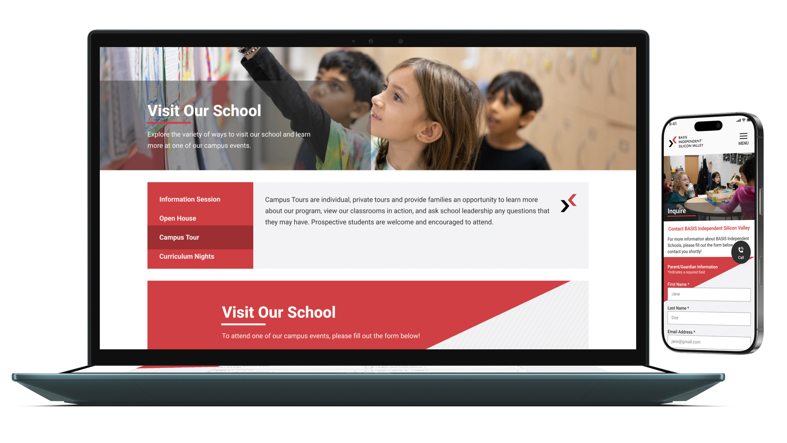
PROJECT OVERVIEW
Client: BASIS Independent Schools
Basis Independent Schools operates multiple school locations across the U.S., each with
its own website and form experience. Over time, this resulted in multiple form types, inconsistent fields,
and different experiences across locations.
I was tasked with evaluating the existing form system and identifying opportunities to create a
simpler, more consistent, and scalable experience for prospective families across all school websites.
My Role
UX/UI Designer & Researcher
Team
1 UX/UI Designer & Researcher
1 Director of Web Product Marketing
2 BASIS stakeholders, including VP of Admissions and Director of Marketing
2 Developers
Timeline
2 months
Tools
Figma
Google slides
Zoom
Google analytics
This project was part of a larger website redesign across BASIS Independent Schools. This case study focuses specifically on the research, strategy, and redesign of the form experience.
TOO MANY FORMS, TOO MANY VARIATIONS
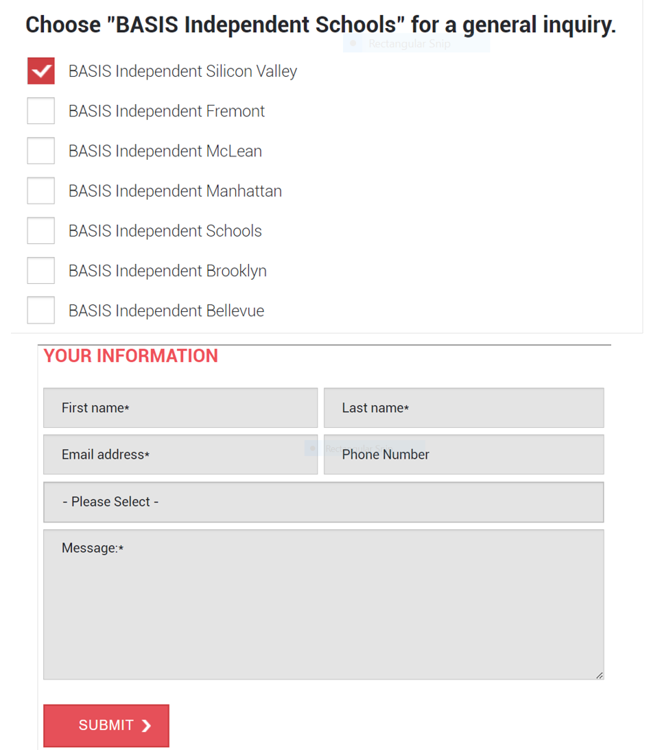
As I audited the existing experience across BASIS Independent Schools, I found that each location had developed its own approach to forms. There were multiple form types serving overlapping purposes, and form fields varied from school to school.
The lack of consistency created a fragmented experience for families and made the system more difficult to scale and maintain.
Further, four separate forms (Contact Us, Interest List, Share Your Thoughts, and Where Should We Go?) were all routed to the same Admissions team, creating unnecessary complexity for families.
Many Types of Forms & Counting…
Contact Us
Application
Blog
Interest List
Share Your Thoughts
Where Should We Go?
Events:
a) Info sessions
b) Open house
c) Campus tours
d) Curriculum night
e) 1:1 admissions calls
f) Entrance exam
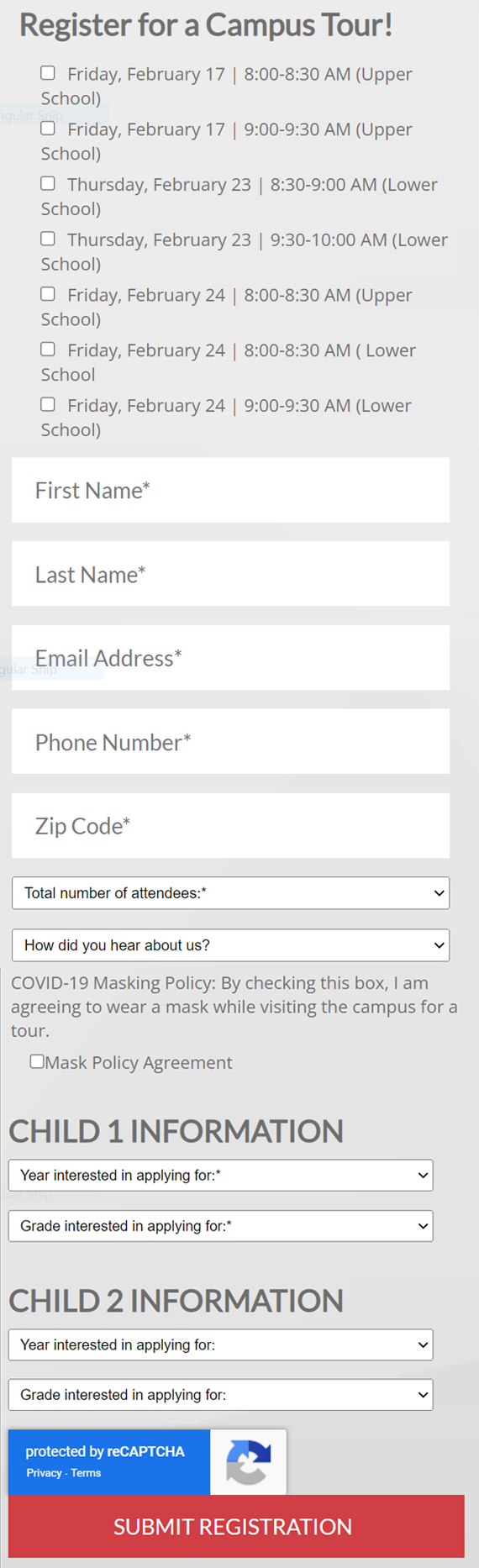
Anytime school representatives created a new Event for parents to attend, a new form was created to support it. Doing so was not scalable. As schools expand across locations and host more events, this approach would quickly lead to an increasingly fragmented form experience.
How might we simplify the form experience while still capturing the information schools need?
THE OPPORTUNITY
I conducted a competitive analysis of how other schools were handling their form submission process, and
what I found was that most competitors relied on a much simpler structure. They had:
Schedule a Tour form: Most competitors’ primary conversion point.
Application form: Some competitors offered an application if families were required to apply to the school.
Interestingly enough, many schools did not have a Contact form. Contact details were provided without
requiring a form. Additionally, forms for interest lists, feedback, blogs, and location suggestions were uncommon.
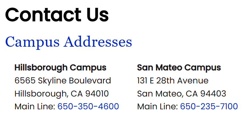
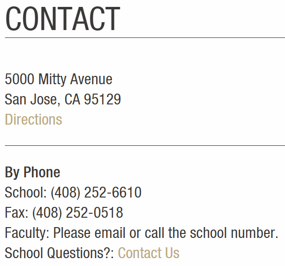
Competitors provided their contact details without requiring a form.
After this analysis, I concluded the BASIS Schools existing form ecosystem was more complex than necessary.
VALIDATING USER NEEDS
While competitors did not offer blog subscription forms, I conducted a survey with 14 parents, and the survey revealed a clear user need: 14 out of the 14 parents who were surveyed said they would be interested in subscribing to their child’s school blog.
This validated keeping the blog form as part of the simplified experience, despite it being uncommon among competitors.
KEY INSIGHTS & DESIGN DIRECTION
Insight #1:
4 forms → 1 destination
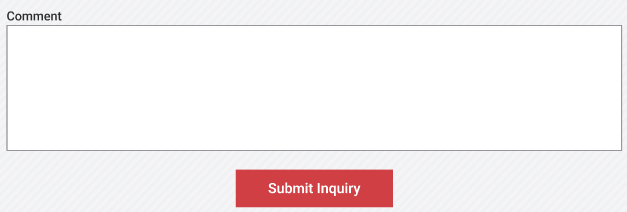
New comment field
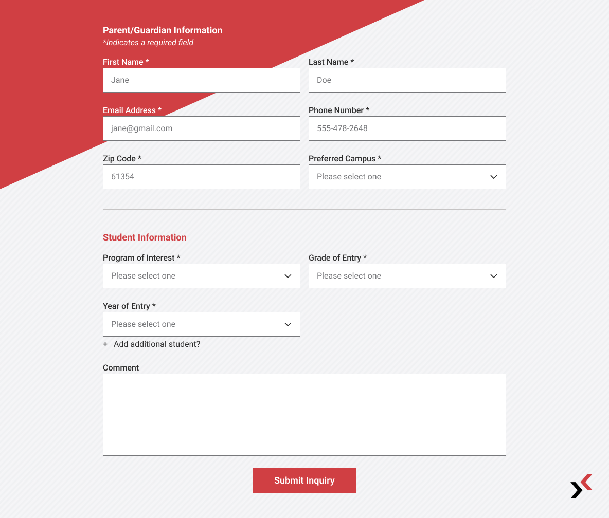
Since submissions from the Contact Us, Interest List, Share Your Thoughts, and Where Should We Go? forms were all routed to the same Admissions team and followed the same internal workflow, and all but Contact Us fell outside the top 20 most-visited pages in Google Analytics, I consolidated them into a single, more intuitive Contact Us experience.
Design direction: A flexible Comment field would allow users to share questions or requests that previously required a separate form, giving them one place to reach Admissions.
Insight #2:
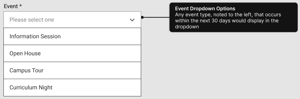
A more scalable form system
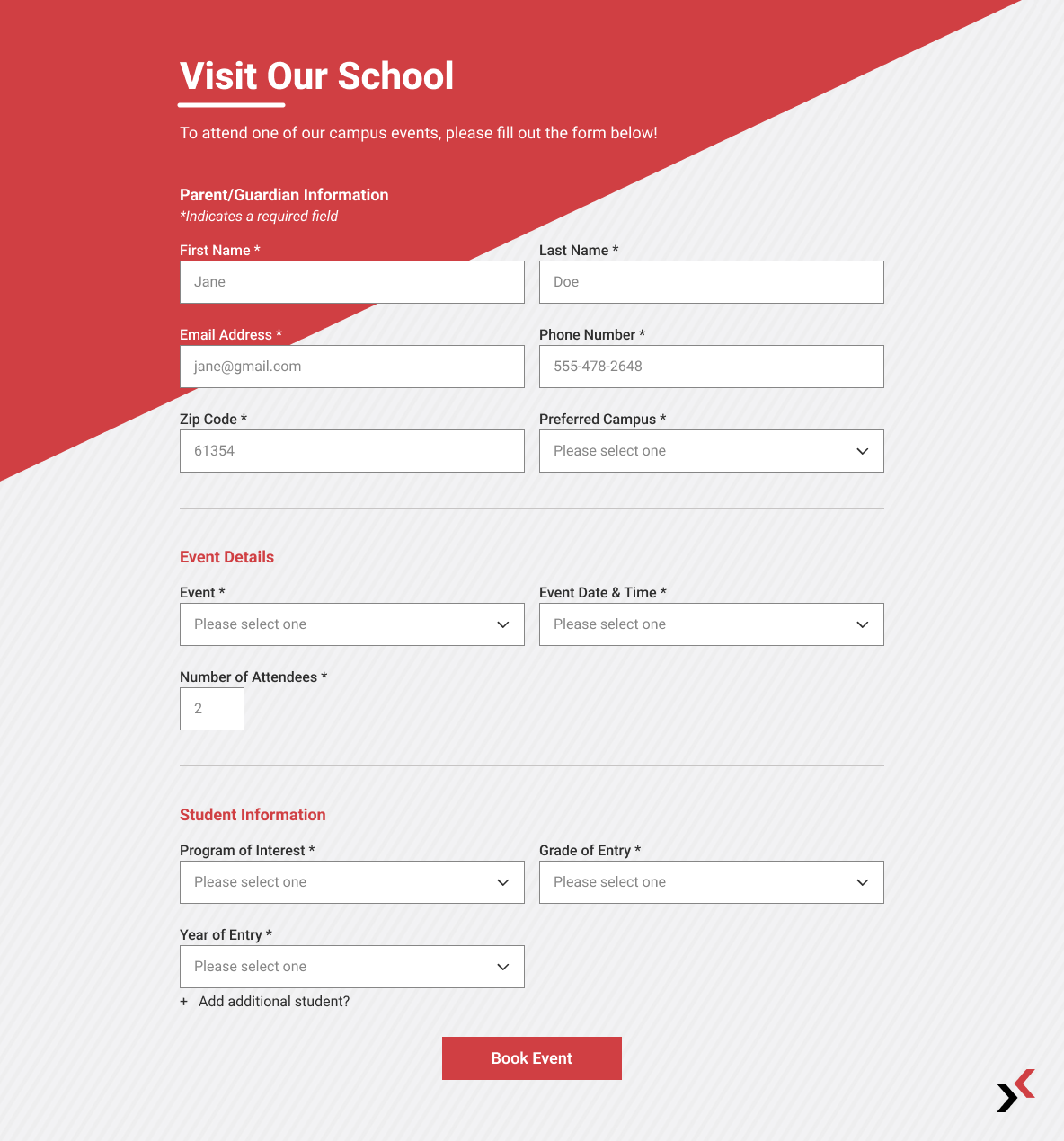
Design direction: Rather than creating a new form for every event, I recommended a single Events form that could be reused across events and locations. I added an Event field where families could select the event type they were interested in, making the form easier for school teams to manage while keeping the experience consistent for families.
Insight #3:
Form best practices
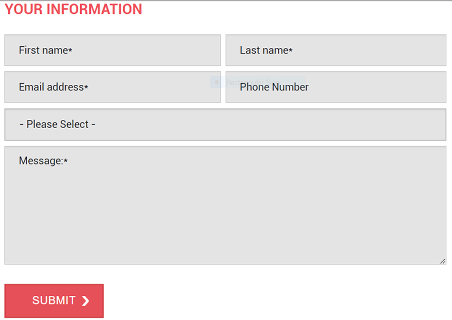
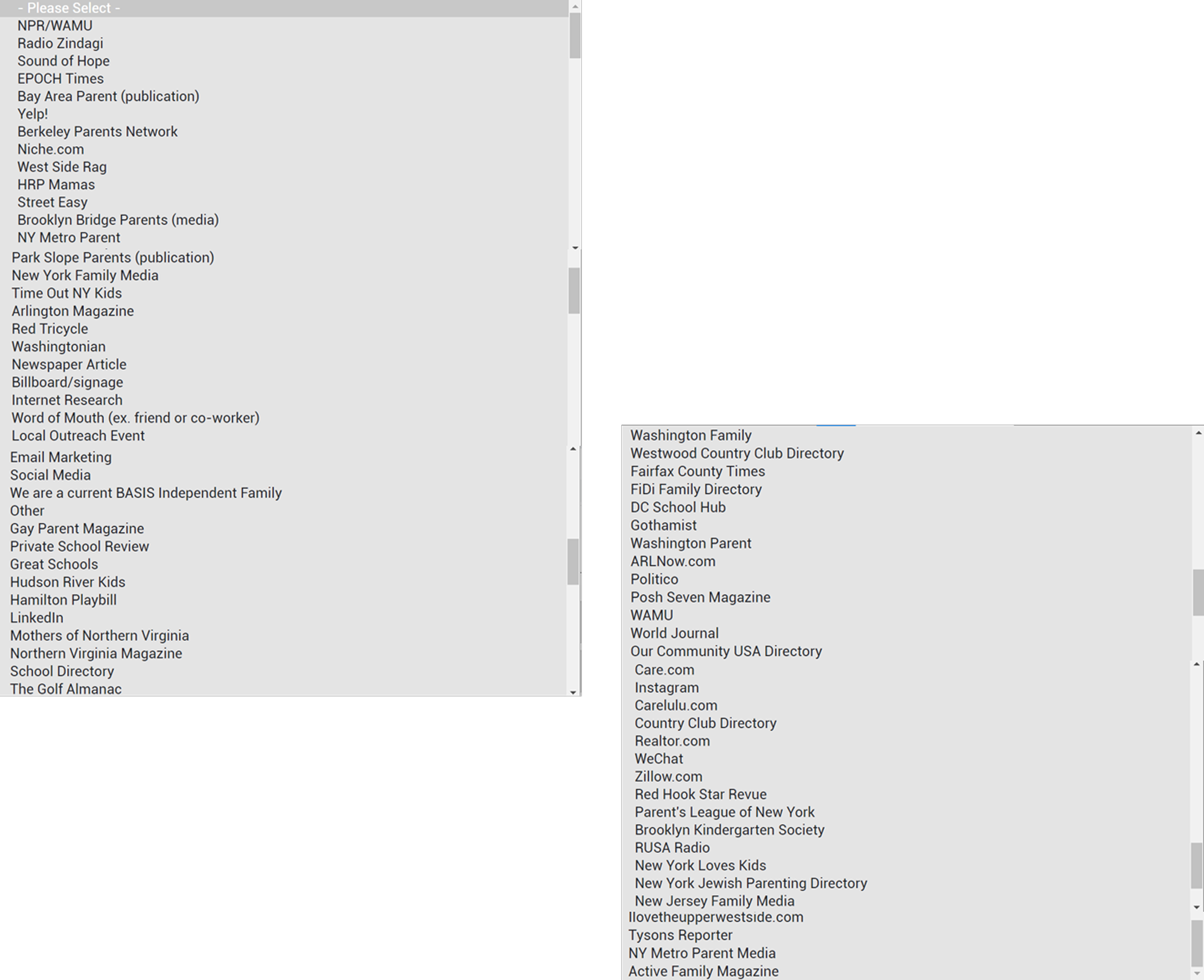
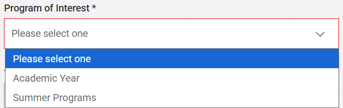
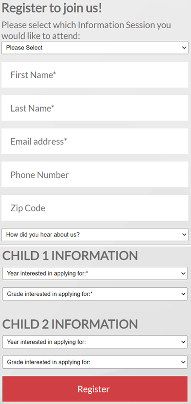
The existing forms lacked clear field labels and guidance. Labels were placed inside the fields, and one dropdown was simply labeled “Please Select,” revealing a long list of 50+ options without explaining what users were selecting.
Design direction: Move labels above each field, use placeholder text for guidance, and replace vague labels with clear, descriptive language so users know exactly what’s expected.
Before
←
→
After
THE NEW EXPERIENCE
Before:
7+ forms…
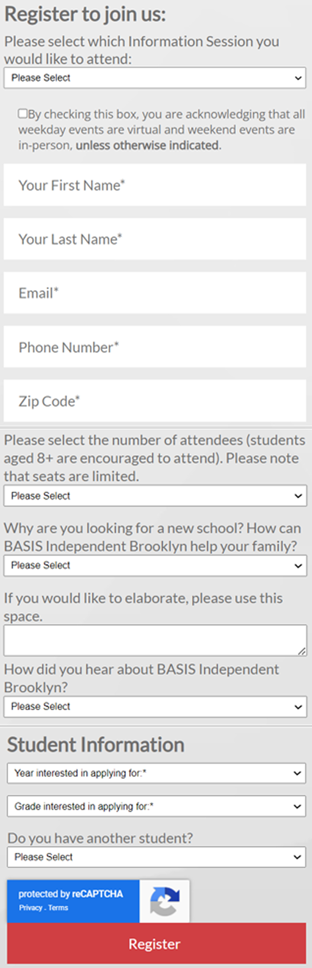

After:
3 streamlined form experiences
Contact Us form
Consolidated four forms into one flexible contact experience.
Events form
Created one reusable form with an Event selector instead of creating a new form for every event.
Blog form
Retained the blog subscription form based on strong parent interest from the survey, but removed the notification frequency field since the blog wasn’t updated frequently enough to make it useful.

For all forms:
Reduced unnecessary fields
Standardized information collected
Created a clearer hierarchy
Simplified form structure
DESIGN & BUSINESS IMPACT
By simplifying and standardizing the form experience, we created a more consistent system across locations while reducing friction for prospective families.
As mentioned, the form experience was one part of a larger website redesign.
In the 12 months following launch, inquiries remained higher year over year, increasing +14% to +92%, alongside increases in other key enrollment metrics including applications, tours, and enrollment.
Inquiry Performance: Our Primary
Business Metric
Average monthly increase
+51%
Highest monthly increase
+92%
Lowest monthly increase
+14%
12 of 12
Months with YoY increase
REFLECTION
This project reinforced that good UX isn't always about adding more. Sometimes, the biggest opportunity comes from stepping back and questioning whether the existing experiences are necessary in the first place. By simplifying the system, my team and I created an experience that was easier for families to navigate and easier for the organization to scale.
Thanks for exploring the project
Interested in working together? Let’s Connect!
View More Projects: